iOS is NOT Perfect
For the majority of users, the iOS 7 update has been quite the refreshing redesign. With skeuomorphism thrown out the window, Apple has once again found themselves designing flat, colourful user interfaces in hopes to modernize their UI. However they have not perfected the UI, yet.
“Grids are good for the soul”
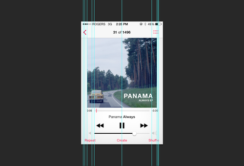
Neatly arranged items are inherently pleasing to the eye. The grid system has been a fundamental graphic design for quite some time now and has always been synonymous with the modernist movement.
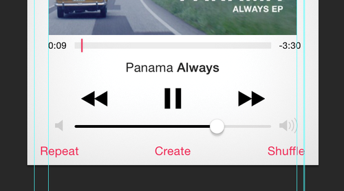
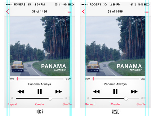
Yesterday I was staring at my iPhone skipping through songs when my eye caught a small, but slightly disarranged error on the “Now Playing” screen.

It shouldn’t have bothered me as much as it did.

Lets fix it.

There we go.


