Background
You may have heard of York University in the news lately. Security is something that the institution takes very seriously and due to recent events has begun taking steps to further ensure student safety. They recently released a mobile app (iOS, Android, BB) for students which “provides quick access to the University’s safety resources, including direct calls to campus security, 911, and key safety services such as goSafe and the Campus Shuttle as well as other important safety information.”
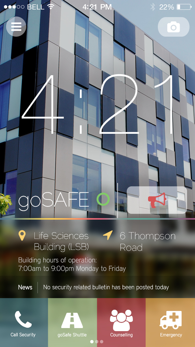
Unfortunately, this app is rarely used by students, and those who do use it criticize its unintuitive and dated user interface. Seeing as I had nothing to do on a sunday, I figured I would give redesigning the application a shot. Unlike the current application, which can be downloaded here, I wanted to design one which would dynamically change based on the current location of the user. This would allow for quick access to location information and would require less interaction between screens.

Interface
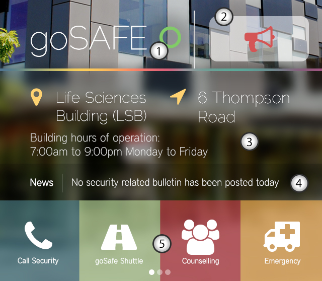
1 - Dynamic safety indicator: This ring will notify the user of the current state of York’s campus security.
2 - Alarm: Large button for quick access to an audible alarm
3 - Your Current Location: The current app does not detect where an individual is. In the event of an emergency, a response team will ask for your location and having this information visible at all times is crucial. Information about the building will also be displayed here.
4 - Live News: In the event of an emergency, security bulletins will be displayed here.
5 - Access Menu: These buttons allow the user to quickly access York’s goSafe offerings.


